TENANT IN TOKUMANCHO
徳万町のテナントビル
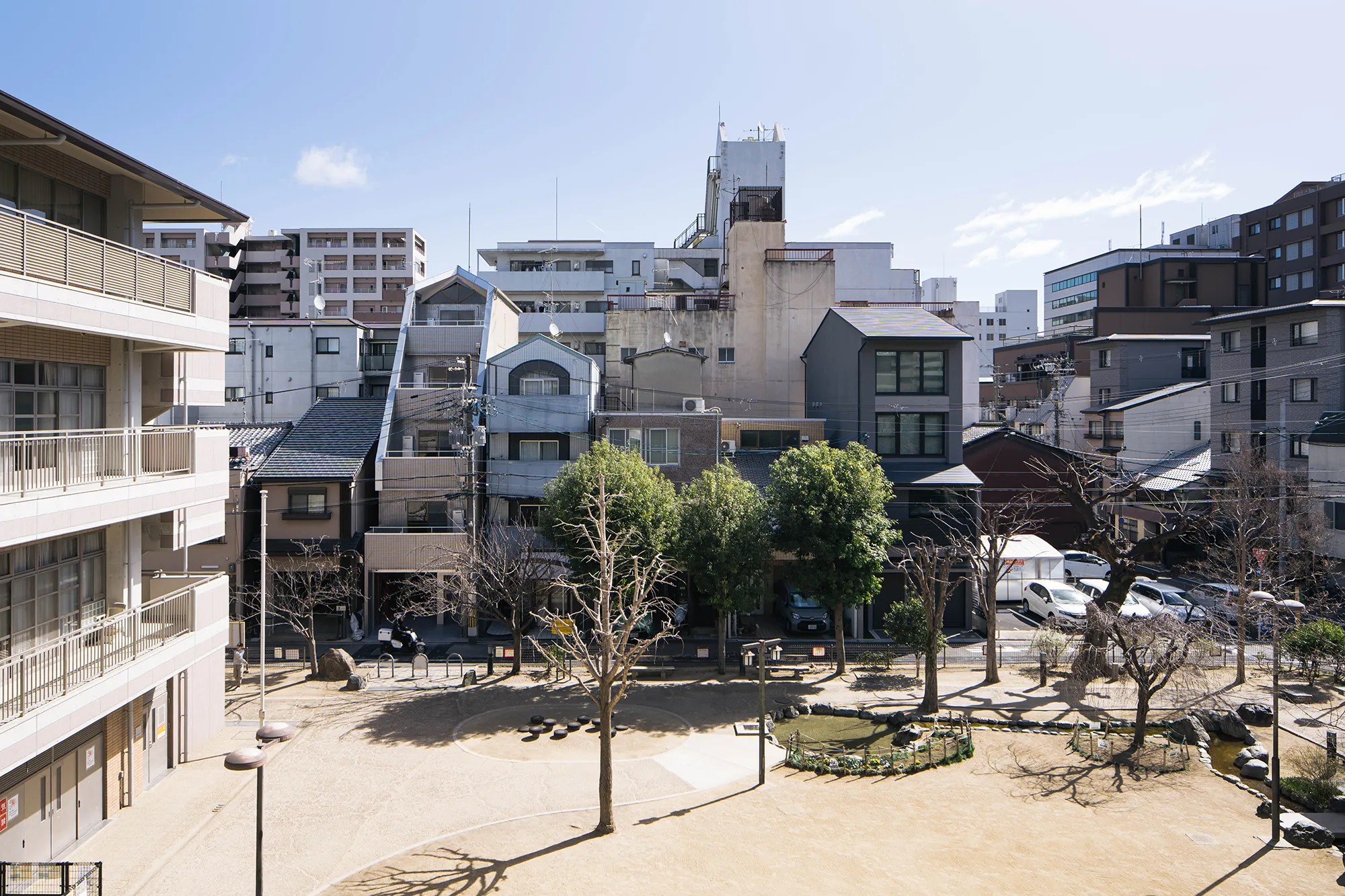
公園を望むビルの再構築
RECONSTRUCTING AN OFFICE INTO A PARK-VIEW SOHO
平成3年竣工の鉄骨造5階建て事務所ビルを、賃貸SOHOへとコンバージョンする計画。一社占有だった空間を、1階にテナント区画、2階から5階をSOHOへと改修した。建物は公園の西側に位置し、上階へいくほど床面積が減っていく階段状の形態を有する。2階以上の各階には広々としたバルコニーがあり、公園への優れた眺望が心地よい。一方で、南北側には隣家が近接しており、採光の取れない排煙窓しかなかった。そのため、必然的にメインの居室を公園に面した西側に配置。南東寄りに位置する既存の回り階段周辺に、キッチンや浴室などの水回りをコンパクトに集約させることで、機能的な動線と給排水の合理化を図っている。
This project involved the conversion of a five-story steel-frame office building, completed in 1991, into a rental SOHO complex. The transformation repurposed a single-tenant workspace into a commercial unit on the first floor and residential SOHO units on the second through fifth floors. Situated to the west of a public park, the building’s stepped silhouette was leveraged to provide each upper unit with a generous balcony and expansive park views. A primary challenge was the proximity of neighboring buildings to the north and south, where the only existing openings were smoke exhaust windows that offered little natural light. In response, the primary living spaces were strategically placed on the western side to face the park. By concentrating the kitchen and bathroom facilities around the existing spiral staircase in the southeast corner, the design achieves both functional circulation and a highly efficient plumbing layout.


画一性からの脱却
BEYOND UNIFORMITY
新築の共同住宅では、コストや施工性の制約から、既製品の組み合わせによる均一な空間になりがちである。本計画では改修であることを活かし、新築特有の「真新しさ」を程よく抑え、時間の蓄積を感じさせるデザインを試みた。2階から5階の各住戸は、床材やクロスの色彩、建具・造作棚の樹種をあえて一律にせず、一部では錆止め塗装を施した既存鉄骨をアラワシとしてアクセントに用いている。部屋ごとに異なる表情を与えることで、単なる立地や広さだけではない、住み手の感性に響く多様な選択肢を提示した。
In newly constructed apartment buildings, spaces often become uniform due to cost constraints and the reliance on mass-produced components. For this conversion, I aimed to steer away from that clinical "newness," instead creating a design that embraces the character and texture inherent in a renovation. Across the second to fifth floors, each unit features a distinct palette of flooring, wallpaper, and timber species for cabinetry. In some areas, the original steel frame—finished with its industrial anti-corrosion coating—is left exposed as a structural accent. By offering these varied interior expressions, the project provides residents with choices rooted in personal taste and ambiance, transcending standard criteria like location or square footage.


既製品と木質のアンサンブル
AN ENSEMBLE OF TIMBER AND THE READY-MADE
白い床・壁・天井に、白い建具と設備機器。そうした「白」に埋め尽くされた現代の共同住宅には、どこか特有の息苦しさを感じる。そこで本計画では、建具や造作棚に用いる樹種をフロアごとに変え、空間に独自の体温を与えた。2階はラワン、3階はMDF、4階はシナ、5階は構造用合板を採用。均質な既製品にはない木目の個体差が、空間に繊細な変化と心地よさをもたらしている。また、既製品のシステムキッチンを採用しつつも、キッチンパネルの単調さを避けるためフレキシブルボード(繊維強化セメント板)を組み合わせるなど、既製品と素材が共存する表情豊かなディテールを追求した。
Modern apartments, often dominated by white floors, walls, ceilings, and fixtures, can feel somewhat suffocating in their clinical uniformity. To counter this, I unified the timber species for cabinetry and shelving within each floor, but varied them from level to level to give the spaces a sense of "breath" and individuality. I selected Lauan for the second floor, MDF for the third, Shina (Japanese basswood) for the fourth, and structural plywood for the fifth. The natural variations in grain, absent in mass-produced goods, create a subtle dynamism and comfort. While the kitchens are standard ready-made units, I replaced typical backsplash panels with flexible boards (fiber-reinforced cement boards) to avoid a monotonous expression and add a raw, textural depth to the interior.


制約からの造形
FORM BORN FROM CONSTRAINTS
脱衣洗面所においても既存窓の位置が制約となり、一般的なミラーキャビネットの設置が困難であった。そこで、既存窓の配置に合わせた扉型や引き戸型の鏡を個別に考案し、機能と意匠を一体化させている。また、コスト抑制とメンテナンス性を考慮し、足場を組まずに完結できる配管・配線計画を採用。換気扇の屋外フードなどを内部から手の届く窓周りに集約させた。その結果、東側の壁面にはパイプスペース(PS)が現れることとなったが、洗面台やガス乾燥機台の造作デザイン、棚板の配置を各室ごとに精緻に調整。露出する設備要素を空間のノイズとするのではなく、改修建築らしいディテールの一部として再構成することで、ポジティブな空間体験へと転換した。
In the laundry and washroom area, the fixed positions of existing windows made it impossible to install standard mirror cabinets. In response, I designed custom mirrored doors and sliding mirrors tailored to each window configuration. To minimize costs and future maintenance, the plumbing and ventilation routes were planned to be accessible from the interior, eliminating the need for external scaffolding. While this strategy resulted in exposed piping and shafts along the eastern wall, these elements were thoughtfully integrated into the interior. By meticulously adjusting the design of the washbasins, dryer stands, and shelving units for each room, I transformed these technical necessities into deliberate architectural details. What could have been a negative constraint was redefined as a positive, character-rich feature of the renovation.


光の反射とカラーコーディネイト
LIGHT REFLECTION AND COLOR COORDINATION
共用部には小窓が設けられているものの、南側建物が近接しているため十分な採光は期待できない。そこで、壁面には鈍いシルバーの塗装を施し、照明やわずかな自然光を空間全体へ拡散させる構成とした。さらに、線状の照明器具から放たれる電球色の光が、無機質な質感の中に瀟洒な表情を演出している。このシルバー色は外観のタイルとも呼応しており、外部のアプローチから内部空間までを視覚的に連続させている。また、鉄骨の柱・梁や階段ササラにはあえて錆止め塗装の色をそのまま採用。壁の塗装とのメリハリにより空間にリズムをもたらしている。
In the common areas, the proximity of the neighboring building to the south severely limits natural light. To address this, I finished the interior walls in a matte silver, allowing both artificial and minimal natural light to diffuse throughout the space. The warm glow from linear light fixtures contrasts with this metallic surface, creating an atmosphere that is both industrial and refined. This silver palette echoes the exterior tiling, establishing a visual continuity from the entrance approach into the building's core. Furthermore, the steel columns, beams, and staircase stringers are finished in a distinct anti-corrosion primer color. This deliberate contrast against the wall finishes highlights the building's skeleton, transforming structural elements into a rhythmic architectural accent.


質感を育むディテール
DETAILS THAT CULTIVATE TEXTURE
鉄骨階段は既存シートを剥がしたままの状態を活かし、最小限の研磨に留めることで、歳月を重ねた鉄固有の風合いを意図的に残した。1階から2階への階段は、改修過程で錆止め塗装を施して以降、養生をあえて行わず、工事中に生じた汚れや飛沫をあえて「仕上げ」として許容している。これにより、改修建築ならではの生々しさと歴史を空間に定着させた。また、館名板は単なる情報の提示ではなく、控えめながらも奥行きのある表現を目指し、アーティストの小宮太郎氏に製作を依頼した。キャンバスの裏側から押し出された絵の具が生む隆起と陰影、そして文字に施された銀箔の経年変化が、時の経過とともにこのビルの新たな表情を紡いでいくだろう。
For the steel staircase, the original covering was removed and the surface minimally polished to preserve the raw, aged texture of the metal. During the renovation of the stairs between the first and second floors, the anti-corrosion primer was applied without protective masking. By intentionally allowing the splashes and marks of the construction process to remain as a final finish, I sought to capture the building's history and the physical reality of its transformation. The building’s signage was conceived not merely as a graphic element, but as a subtle yet profound artistic statement. Created by artist Taro Komiya, the sign features paint pushed through the back of the canvas to create sculptural ridges and shadows. Finished with silver leaf that will oxidize over time, the piece acts as a living element that evolves alongside the building, embracing the beauty of gradual change.
INFORMATION
- Location
- 京都府京都市
- Use
- 店舗+SOHO(賃貸)
- Project Type
- リノベーション
- Building Scale
- 鉄骨造/ 5階建
- Gross Floor Area
- 274.8㎡(83.1坪)
- Area by Floor
- 69.05㎡/65.41㎡/56.50㎡/47.59㎡/36.25㎡+ロフト
- Design Period
- 2025年7月~2025年10月
- Construction Period
- 2025年11月~2026年3月/5ヶ月
- Client
- 店舗+SOHO(賃貸)
- Real Estate
- 吉祥院安田
- Contractor
- Handman
- Photographer
- 八杉和興