CYCLE STATION AT OTSU PORT
大津港サイクルステーション
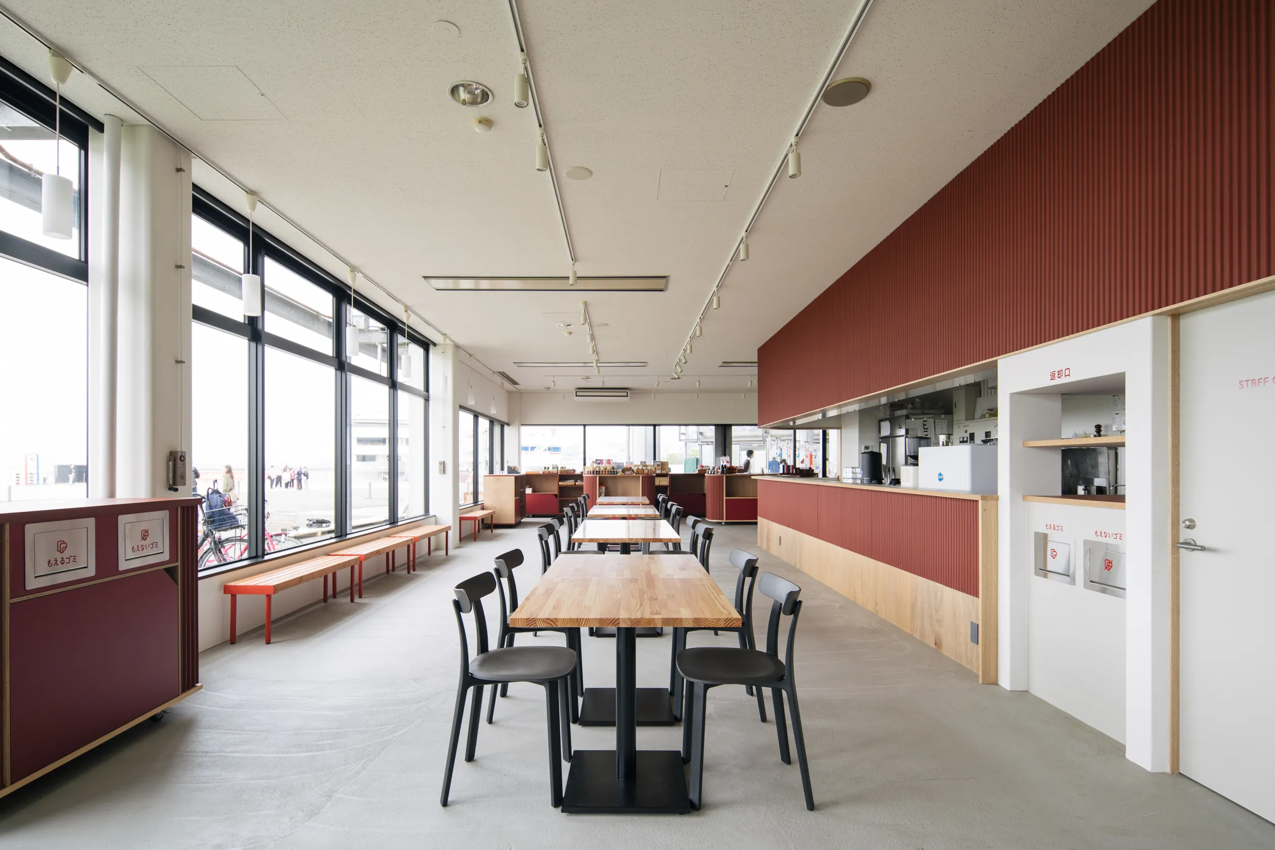
可動式什器による包括力のある空間
INCLUSIVE SPACE CREATED BY MOBILE FURNITURE
設計・デザイン・施工からなるチームでプロポーザルに挑み、受託した大津市の公共事業。既存の大津港内に位置する喫茶・ラウンジおよび売店区画を、サイクルステーション(物販・飲食を含む)へと転換する計画である。本プロジェクトには、「限られた予算」「公募時点での運営事業者未定」「将来的な変化への対応」という3つの大きな制約があった。これらを解決する手法として、私たちは『可動式什器』に重きを置いた空間構成を提案した。建築工事としての作り込みを最小限に抑えつつ、什器の延長線上にあるような意匠を全体に展開。運営者の工夫を受け入れることができる包括力の高い空間を目指した。
This is a public project commissioned by Otsu City after a successful joint proposal by a design and construction team. The project involves repurposing the existing cafe, lounge, and retail areas within Otsu Port into a "Biwaichi" cycle station—a hub for cyclists that includes both retail and dining facilities. The design was shaped by three primary challenges: a limited budget, the fact that the operator had not yet been selected at the time of the proposal, and the need for adaptability to future changes. To address these, our proposal focused on the use of "Mobile Furniture." By minimizing permanent architectural interventions and treating the interior as an extension of the furniture itself, we aimed to create an inclusive and versatile space that can evolve alongside its users.


内と外を横断できる「持ち運べる」施設
A PORTABLE HUB, BRIDGING INTERIOR AND EXTERIOR
施設名称である『O-PORT-able(オー・ポータブル)』は、【Otsu-PORT / 大津港】と【portable / 持ち運びできる】を掛け合わせた造語であり、名称も大津市に提案して採用されている。サイクリストや観光客、地域住民など、多様な人々が利用する拠点を目指しているが、行政側も含め運用の詳細は手探りの状態であった。そこで、「動かす」「増やす」といった現場での試行錯誤を容易にするため、『可動式什器』を空間の主役に据えた。レンタサイクル用カウンターを屋外に持ち出して利用したり、イベント時にゴミ箱を外部へ移動させたりといった将来的な展開を見越し、可動式什器の機能に幅を持たせている。
The facility name, "O-PORT-able," is a coined term combining "Otsu Port" with "portable." This naming was proposed by our team and officially adopted by Otsu City. While the space was envisioned as a hub for cyclists, tourists, and local residents, the operational specifics remained experimental for both the administration and users. To facilitate a process of trial and error—allowing elements to be freely moved or added—we placed "Mobile Furniture" at the heart of the design. By enabling the rental counter to be taken outdoors or trash bins to be relocated for events, we expanded the role of mobile furniture to support versatile developments beyond the interior.


拡張する自転車ストレージ
SCALABLE BIKE STORAGE
公募で設置が求められた「屋外自転車保管倉庫」も、将来的な自転車の増設を見越し、単管パイプをベースとした汎用性の高い可動式ユニットとして製作した。各ユニットは個別に施錠が可能。ユニット同士の連結や地面への固定も行えるため、盗難防止対策も万全である。可動式のユニットとすることで、利用者の増加に伴う増設が必要になった場合でも、建築工事による拡張や増築よりはるかに容易に対応できる。予算的・時間的にも有効な手法として提案し、採用された。さらに、これらの什器はイベント時にマルシェの屋台などへ転用することも想定した設計としている。
The "Outdoor Bicycle Storage" required by the public proposal was designed as a versatile, mobile unit based on single-pipe scaffolding, anticipating future expansion. Each unit can be locked individually, and security is ensured by the ability to connect units together or anchor them to the ground to prevent theft. By utilizing these mobile units, adding storage to accommodate an increase in users becomes far easier than traditional architectural expansion or construction. This approach was proposed and adopted as a cost-effective and time-efficient solution. Furthermore, the units are designed with multi-purpose use in mind, allowing them to be repurposed as market stalls during local events.


多様な人々が混じり合う拠点へ
A HUB FOR HARMONIOUS MINGLING
自転車倉庫に加え、商品棚、カウンター、ベンチ、サイン什器など多岐にわたるプロダクトを制作した。改修前の雑多な印象を払拭するため、波板やリノリウムといった素材をテーマカラーに沿って選定し、展示と収納が美しく共存するデザインを追求。茜色の脚が印象的なベンチは、屋外の芝生へ持ち出せば、さらに映える。この先、施設単体で完結せず、他拠点と連携しながら広がることを期待している。琵琶湖に海水は流れないが、多様な人々が混じり合い、新たな賑わいが生まれる「汽水域」のような場所になればと思う。
We designed a wide range of custom fixtures, including shelving, counters, benches, and signage. To resolve the cluttered impression of the former shop, we used materials like corrugated metal and linoleum in coordinated theme colors, creating a design where display and storage coexist beautifully. The benches, with their distinctive madder-red legs, are also intended for use on the outdoor lawn. Rather than an isolated project, we envision this facility evolving in tandem with future hubs. While seawater does not flow into Lake Biwa, I hope this place becomes a kind of "brackish zone"—a vibrant crossroads where local residents, tourists, and cyclists naturally mingle.


出発地としてのブランディング
BRANDING THE DEPARTURE POINT
公募要件は「指定名称の表示物製作」のみであったが、私たちはサインによる視覚的な賑わいの創出が重要であると考え、ロゴ、ピクトグラム、さらにはオリジナルフォントの作成まで提案に盛り込んだ。施設全体、そして今後の展開を見据えた包括的なブランディングを行っている。ビワイチに関連するサインの多くが「琵琶湖の青」を中心とした寒色系を採用する中、あえて赤系の「海老色・赤銅色・茜色」をテーマカラーに選定した。これは、周囲の施設に埋没させず、新たな「ビワイチの出発地」としての個性を際立たせるための戦略である。タイポグラフィやピクトグラムは、波板の凹凸面への転写も考慮した独自の意匠とした。
While the initial requirements were limited to "fabricating signage for the designated name," we believed that visual vibrancy through environmental graphics was essential. We took a proactive approach by designing the logo, pictograms, and even a custom typeface to establish a comprehensive brand identity for future expansion. In contrast to the typical blue-toned signage associated with Lake Biwa and "Biwaichi," we selected a red-based palette of Madder and Russet. This choice ensures the facility stands out from its surroundings and defines its identity as a new "Starting Point" for cyclists. The typography and pictograms were specifically developed to remain legible and distinctive even when applied to the textured surfaces of corrugated metal.
INFORMATION
- Location
- 滋賀県大津市
- Use
- サイクルステーション及び飲食店
- Project Type
- リノベーション
- Building Scale
- 鉄骨造/2階建1階の2区画
- Gross Floor Area
- 219.08㎡(66.3坪)
- Area by Floor
- 101.43㎡/117.63㎡
- Design Period
- 2021年7月~2021年11月
- Construction Period
- 2021年12月~2022年3月/4ヶ月
- Client
- 大津市観光振興課
- Contractor
- 清水建設工業
- Photographer
- 八杉和興